- Getting started
- Installing Theme and Plugins
- Demo Content Installation
- Theme Options
- Sidebars / Widgets
- Setting the slider
- Setting the pages
- Setting the Blog
- Setting the Portfolio
- Setting the Doctors (Team Members)
- Setting the Testimonials
- Setting the Client's Logo
- Visual Composer
- Setting WPML Multi-Lanuage
- Translation
- Shortcodes
- FAQ
- Migrate
- Migrate
- Sources / Credits
Shortcodes
Shortcodes
Here are list shortcodes with options in our theme.
[icon]
This will show icon
Options:
package(required) : Add font package name here. Options are "fa", "lineicons", "entypo", "typicons", "iconic", "mpictograms", "meteocons", "mfglabs", "maki", "zocial", "brandico", "elusive" and "websymbols". Also as this is required field, we request you to add fa as the font-awesome font is default in our theme.type: Add icon name here. There are so many icons to select. Also this depends on which package you selected. Click here to go to Font Awesome site to get list of icons with name (you must add "fa" in the "package" option).size: Add icon size here. Options are "tiny","small","medium","large" and "extra-large"align: Add alignment of the icon here. Options are "left", "center" and "right".roundborder: if you like to set round background color than set this to "yes". Leave this empty if you don't want to set any background effect.bgcolor: If you like to set rounded border than set color of the box box. Options are "skincolor", "grey", "blue", "turquoise" ,"green", "orange", "red" and "black",
Example usage:
[icon package="fa" type="file" size="small" bgcolor="grey" align="center" roundborder="yes"][icontext]
This will show text line (or paragraph) with icon
Options:
package(required) : Add font package name here. Options are "fa", "lineicons", "entypo", "typicons", "iconic", "mpictograms", "meteocons", "mfglabs", "maki", "zocial", "brandico", "elusive" and "websymbols". Also as this is required field, we request you to add fa as the font-awesome font is default in our theme.icon: Add icon name here. There are so many icons to select. Also this depends on which package you selected. Click here to go to Font Awesome site to get list of icons with name.
Example usage:
[icontext icon="file"]Welcome to our site[/icontext][languageswitcher]
Shows language switcher of WPML plugin, Please note that you must installed WPML plugin to show language switcher. Also you can configure the dropdown settings from WPML plugin settings directly.
Options:
No Options
Example usage:
[languageswitcher][current-year]
This will show the current year.
Options:
No Options
Example usage:
[current-year][site-title]
This will show the Site Title.
Options:
No Options
Example usage:
[site-title][site-url]
This will show the Site URL.
Options:
No Options
Example usage:
[site-url][site-tagline]
This will show the Site Tagline.
Options:
No Options
Example usage:
[site-tagline][skincolor]
This will show text in Skin Color.
Options:
No Options
Example usage:
[skincolor]This text will show in skincolor[/skincolor][kwayy-social-links]
This will show Social links set from Admin > Appearance > Theme Options > Social Links section.
Options:
No Options
Example usage:
[kwayy-social-links]List Syles
This section shows how different Styled List can be achieved. For example see different styled list shown on Typography page.
There are 12 list styles available to choose from. Nine of them are icon based. Please note that there is no extra shortcode for list styles and just add class in the UL or OL element to get the icon list.
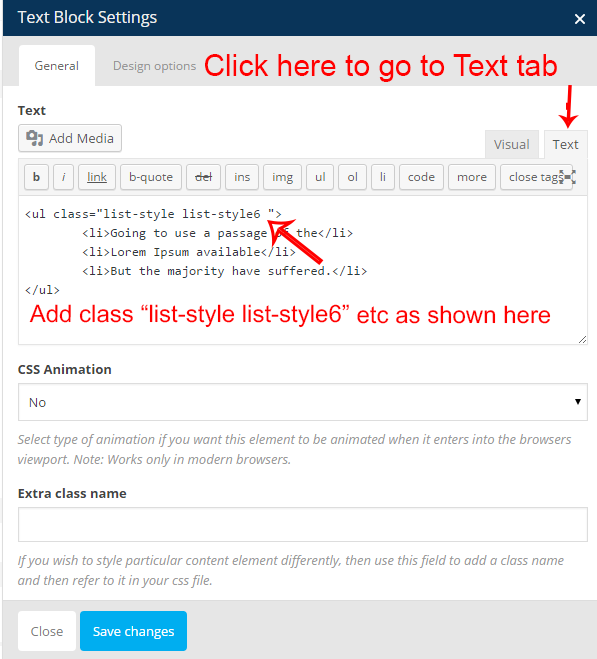
Here are steps how to add list style via Text element:
Go to Text tab and add add extra class list-style list-style6 as shown in the image below:
See samples below:
Default (UL LI) list style preview:
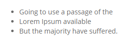
									<ul>

									<li>Going to use a passage of the</li>

									<li>Lorem Ipsum available</li>

									<li>But the majority have suffered.</li>

									</ul>
Default (OL LI) ordered list style preview:
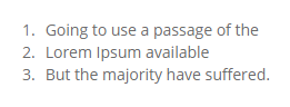
									<ol>

									<li>Going to use a passage of the</li>

									<li>Lorem Ipsum available</li>

									<li>But the majority have suffered.</li>

									</ol>
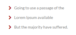
Special Bullet list style preview:
									<ul class="special">

									<li>Going to use a passage of the</li>

									<li>Lorem Ipsum available</li>

									<li>But the majority have suffered.</li>

									</ul>
1st list style preview:
									<ul class="list-style list-style1 ">

									<li>Going to use a passage of the</li>

									<li>Lorem Ipsum available</li>

									<li>But the majority have suffered.</li>

									</ul>
2nd list style preview:
									<ul class="list-style list-style2 ">

									<li>Going to use a passage of the</li>

									<li>Lorem Ipsum available</li>

									<li>But the majority have suffered.</li>

									</ul>
3rd list style preview:
									<ul class="list-style list-style3 ">

									<li>Going to use a passage of the</li>

									<li>Lorem Ipsum available</li>

									<li>But the majority have suffered.</li>

									</ul>
4th list style preview:
									<ul class="list-style list-style4 ">

									<li>Going to use a passage of the</li>

									<li>Lorem Ipsum available</li>

									<li>But the majority have suffered.</li>

									</ul>
5th list style preview:
									<ul class="list-style list-style5 ">

									<li>Going to use a passage of the</li>

									<li>Lorem Ipsum available</li>

									<li>But the majority have suffered.</li>

									</ul>
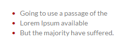
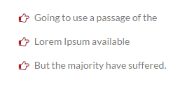
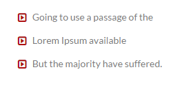
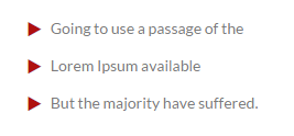
6th list style preview:
									<ul class="list-style list-style6 ">

									<li>Going to use a passage of the</li>

									<li>Lorem Ipsum available</li>

									<li>But the majority have suffered.</li>

									</ul>
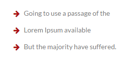
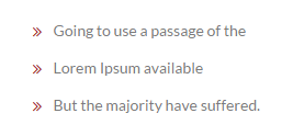
7th list style preview:
									<ul class="list-style list-style7 ">

									<li>Going to use a passage of the</li>

									<li>Lorem Ipsum available</li>

									<li>But the majority have suffered.</li>

									</ul>
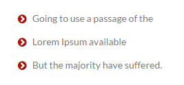
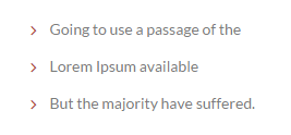
8th list style preview:
									<ul class="list-style list-style8 ">

									<li>Going to use a passage of the</li>

									<li>Lorem Ipsum available</li>

									<li>But the majority have suffered.</li>

									</ul>
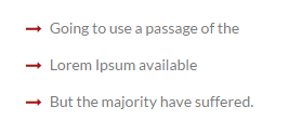
9th list style preview:
									<ul class="list-style list-style9 ">

									<li>Going to use a passage of the</li>

									<li>Lorem Ipsum available</li>

									<li>But the majority have suffered.</li>

									</ul>
Dropcaps
This section shows how different dropcaps view can be achieved. For example see different styled dropcaps on Typography page.
There are three dropcap styles available to choose from. Please note that there is no extra shortcode for dropcaps and just add class in the SPAN tag to get the dropcap effect.
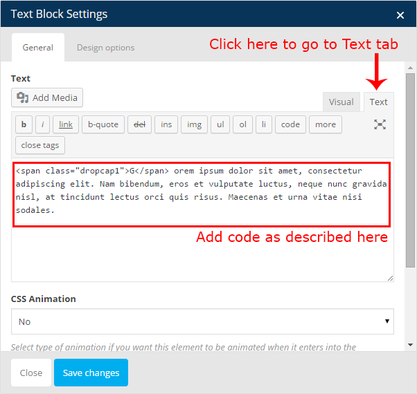
Here are steps how to add dropcaps via Text element:
Go to Text tab and add HTML code as given below:
See samples below:
1st Dropcap style preview:
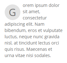
<p><span class="dropcap1">G</span> orem ipsum dolor sit amet, consectetur adipiscing elit. Nam bibendum, eros et vulputate luctus, neque nunc gravida nisl, at tincidunt lectus orci quis risus. Maecenas et urna vitae nisi sodales.</p>
2nd Dropcap style preview:
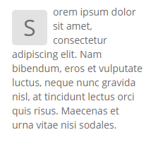
<p><span class="dropcap2">S</span> orem ipsum dolor sit amet, consectetur adipiscing elit. Nam bibendum, eros et vulputate luctus, neque nunc gravida nisl, at tincidunt lectus orci quis risus. Maecenas et urna vitae nisi sodales.</p>
3rd Dropcap style preview:
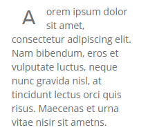
<p><span class="dropcap3">A</span> orem ipsum dolor sit amet, consectetur adipiscing elit. Nam bibendum, eros et vulputate luctus, neque nunc gravida nisl, at tincidunt lectus orci quis risus. Maecenas et urna vitae nisir sit ametns.</p>